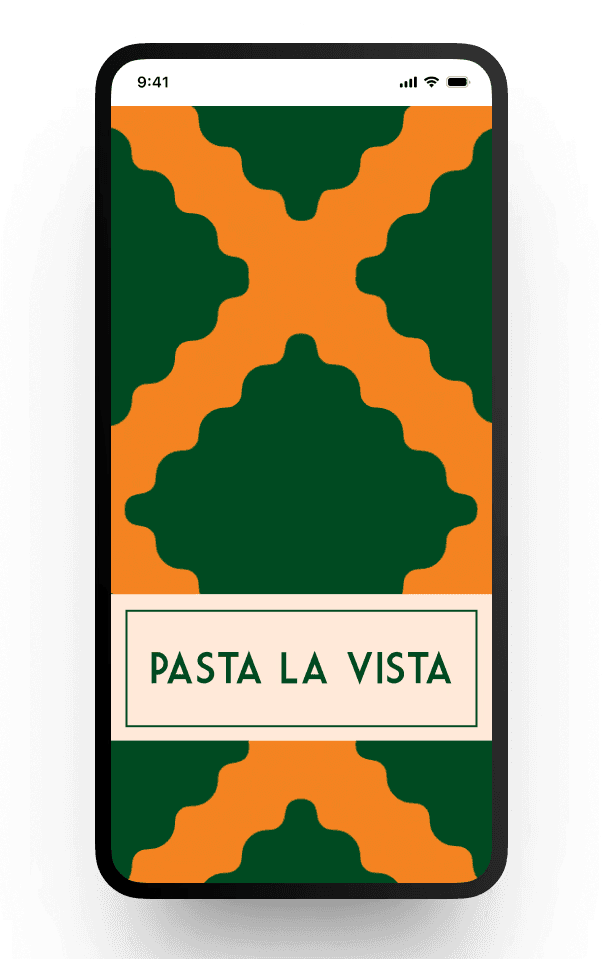
Pasta La Vista
Pasta La Vista
A playful UI design for a restaurant app.
A playful UI design for a restaurant app.

UI Case Study
UI Case Study


Overview 🤓
Overview 🤓
In this school project, we were tasked with selecting a category and designing a solution from scratch, but from a design perspective, without UX research. Our team chose to focus on restaurants, and we all had to learn Figma to bring our ideas to life—especially me, as I was completely new to the tool. While the project was a collaborative effort, I took the initiative to practice further, and what I'm presenting here is the design work I created independently.
In this school project, we were tasked with selecting a category and designing a solution from scratch, but from a design perspective, without UX research. Our team chose to focus on restaurants, and we all had to learn Figma to bring our ideas to life—especially me, as I was completely new to the tool. While the project was a collaborative effort, I took the initiative to practice further, and what I'm presenting here is the design work I created independently.
My role:
My role:
Visual Designer
Visual Designer
The team:
The team:
4 UX Designers
4 UX Designers
Duration:
Duration:
15 Jan - 8 Feb 2024 (3 weeks)
15 Jan - 8 Feb 2024 (3 weeks)
Tools:
Tools:
Figma, Figjam.
Figma, Figjam.
Client:
Client:
NA
NA

Pasta la vista
Pasta la vista
We chose the name 'Pasta la Vista' as a fun play on words, aiming to create a memorable and catchy brand from the start. Overall, we wanted to keep this playful approach with the names of the dishes and their descriptions.
We chose the name 'Pasta la Vista' as a fun play on words, aiming to create a memorable and catchy brand from the start. Overall, we wanted to keep this playful approach with the names of the dishes and their descriptions.
Color Palette 🎨
Color Palette 🎨
I decided to move away from conventional colors and kept only the dark green as a nod to Italian roots.
I chose a retro and playful color palette to convey a sense of freshness and modernity.
This selection aims to make the restaurant app visually appealing and memorable at first glance, standing out with its vibrant uniqueness.
#014921
#D9C952
#F48722
#FF5500
#FFBBA6
#FFEAD9
#000000
#504F4E
#A8A8A8
#DBDBDB
#FFFFFF
Typography 🖊️
Typography 🖊️
Primary
Primary
I chose the Art Deco-based logotype typography, characterized by its elegant lines and geometric shapes, to create an interesting combination with the retro color palette.
I chose the Art Deco-based logotype typography, characterized by its elegant lines and geometric shapes, to create an interesting combination with the retro color palette.
regular
MARKET DECO 25
MARKET DECO 35
MARKET DECO 40
MARKET DECO 60
MARKET DECO 60
Secondary
Secondary
The combination of Market Deco with Nunito Sans strikes a perfect balance between elegance and functionality, ensuring that all design elements are coherent and attractive, while facilitating a clear reading experience.
The combination of Market Deco with Nunito Sans strikes a perfect balance between elegance and functionality, ensuring that all design elements are coherent and attractive, while facilitating a clear reading experience.
Regular
Nunito Sans Regular 12
Nunito Sans Regular 14
Semi Bold
Nunito Sans Semi Bold 16
Nunito Sans Semi Bold 18
Bold
Nunito Sans Bold 14
Nunito Sans Bold 20
Extra Bold
Nunito Sans Extra Bold 14
Nunito Sans Extra Bold 18
Nunito Sans Extra Bold 20
Graphic Elements 🍥
Graphic Elements 🍥
My fascination with patterns led me to be inspired by the various shapes of pasta to create unique textures that reflect the style of the famous Italian tiles. This choice adds depth and character to the restaurant's design, fusing traditional elements with a modern and creative approach.
My fascination with patterns led me to be inspired by the various shapes of pasta to create unique textures that reflect the style of the famous Italian tiles. This choice adds depth and character to the restaurant's design, fusing traditional elements with a modern and creative approach.
Penne
Conchiglie
Farfalle
Ravioli


Photographic style 📷
Photographic style 📷
Photographic style 📷
I opted for a photographic style featuring
cut-out images of drinks and dishes. Overhead shots of pasta on white plates were used to emphasize the pasta's appearance and make it the focal point.
I opted for a photographic style featuring cut-out images of drinks and dishes. Overhead shots of pasta on white plates were used to emphasize the pasta's appearance and make it the focal point.
I opted for a photographic style featuring cut-out images of drinks and dishes. Overhead shots of pasta on white plates were used to emphasize the pasta's appearance and make it the focal point.


SENSUAL SPAGHETTI SERENADE
Seductive spaghetti, bathed in tomato allure and a hint of basil, creating a melody of flavors.
Gluten
230 kr
Playful Copywriting ✏️
Playful Copywriting ✏️
Playful Copywriting ✏️
We decided to play with words in our dish and drink names and descriptions to showcase the passion behind each one. This playful copywriting style captures the enthusiasm and creativity that define the restaurant´s offerings, making the menu both engaging and reflective of the brand's lively spirit.
We decided to play with words in our dish and drink names and descriptions to showcase the passion behind each one. This playful copywriting style captures the enthusiasm and creativity that define the restaurant´s offerings, making the menu both engaging and reflective of the brand's lively spirit.
Here you can find our
complete process ⬇️
Here you can find our complete
process ⬇️
1
Defining our Point Of Departure (POD) ✅
Defining our Point Of Departure (POD) ✅
Defining our Point Of Departure (POD) ✅
We began the project by defining our point of departure as a team, where we clarified the purpose, the desired outcome, how to achieve it, as well as the success and failure scenarios. This aligned us around clear objectives and a path to approach the project.
We began the project by defining our point of departure as a team, where we clarified the purpose, the desired outcome, how to achieve it, as well as the success and failure scenarios. This aligned us around clear objectives and a path to approach the project.

2
Desk Research 🔎
Desk Research 🔎

Desk research focused on reviewing existing platforms to analyze menu structures and functionalities, helping us identify best practices and design patterns. Also, we explored collaborative platforms to determine whether to design an app for a restaurant or a tool for local restaurants, which was crucial for defining our approach and ensuring our design met user needs.
Desk research focused on reviewing existing platforms to analyze menu structures and functionalities, helping us identify best practices and design patterns. Also, we explored collaborative platforms to determine whether to design an app for a restaurant or a tool for local restaurants, which was crucial for defining our approach and ensuring our design met user needs.
Desk research focused on reviewing existing platforms to analyze menu structures and functionalities, helping us identify best practices and design patterns. Also, we explored collaborative platforms to determine whether to design an app for a restaurant or a tool for local restaurants, which was crucial for defining our approach and ensuring our design met user needs.
3
Brainstorming 🧠
Brainstorming 🧠
During our brainstorming sessions, we generated a variety of creative ideas aimed at enhancing the dining experience. The following concepts emerged as potential features for our app:
Storytelling journey for menu items.
Sexy wording' to enhance menu appeal.
Incorporation of NFC chips for a more interactive digital menu.
Use of GIFs and moving imagery in the menu.
Diners can join a 'room' to see highlighted dishes and friends' preferences for the evening.

4
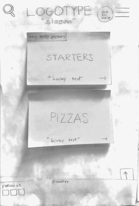
Sketching & Ideation 📓
Sketching & Ideation 📓
Each team member created personal sketches to visualize their individual visions for the app, allowing for the expression of unique ideas and perspectives.
"Our biggest ideas were having a “table hub”, where you could see and interact with the other people at the table in some way."
Also reoccurring idea were the recommendation within the food pages, for more selling points.
"Another feature that we liked a lot was to be able to know your waiter in a more personal way and be able to change the tip for him."


9
2
9
2
9
2
13
10
8
5
4
12
3
6
7
14
11
1
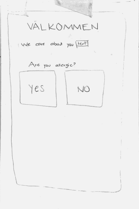
Option for paying my bill and/or others on the same table
Status of order indication
Allergies, vegan, gluten
Showing others order
Be playful with the symbols
Like button (social media feeling)
Most liked dishes
Use of animations
Group table: see your whole table
Play with words
Tip your waiter
Call for the waiter
Illustrations or really nice pictures
Recommended wines
5
Defining our style as a group 💃🏻
Defining our style
as a group 💃🏻
Defining our style as a group 💃🏻
With the Hi-Fi process ahead we decided to make our separate designs, one for each of us based on the features we decided in the sketching process. We made a basic structure to follow and then let each person do their own interpretation of it.
After this we went through each design, and decided how the features should look like, also adding and taking away a few features based on what we saw was needed and not.
Anna
design
Anna
design

Dayanne
design
Dayanne
design
Mia
design
Mia
design
6
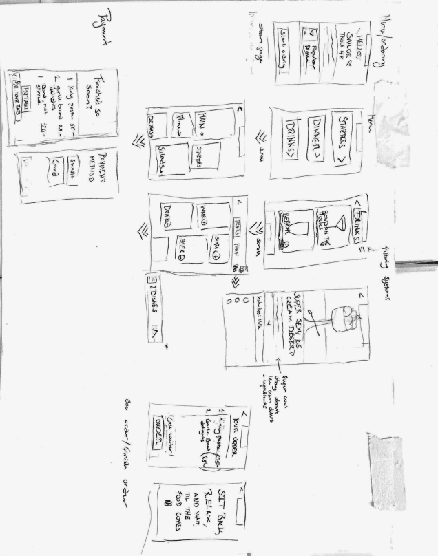
User Flows 👤
User Flows 👤
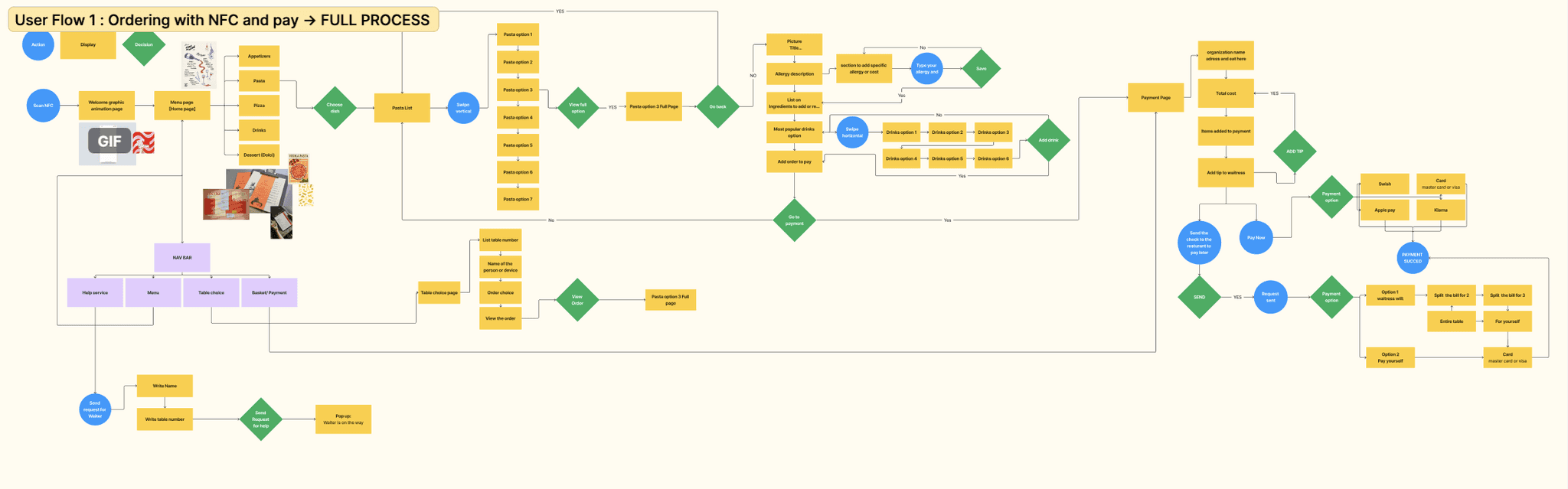
Once we identified the key features, we collaboratively developed the user flows to define how these features would work together. We developed these ones:
Menu List
Help Service
My Table
Payment
Once we identified the key features, we collaboratively developed the user flows to define how these features would work together. We developed these ones:
Menu List
Help Service
My Table
Payment
7
Lo-Fi Design 💻
Lo-Fi Design 💻
With the user flows in place, we moved on to designing low-fidelity wireframes. Each team member was responsible for creating a user flow, and once all designs were completed, we combined and refined them to ensure consistency and cohesion across the app.
With the user flows in place, we moved on to designing low-fidelity wireframes. Each team member was responsible for creating a user flow, and once all designs were completed, we combined and refined them to ensure consistency and cohesion across the app.

8
Team design & My personal design 😊
Team design & My personal design 😊
The final design successfully emphasized consistency, which was one of our main goals. However, in doing so, we felt that some of the app's personality was lost, and the green color scheme may have become too dominant. Despite these challenges, for our first project in Framer, it was a valuable learning experience, and we gained a lot of insight into both the tool and the design process.
The final design successfully emphasized consistency, which was one of our main goals. However, in doing so, we felt that some of the app's personality was lost, and the green color scheme may have become too dominant. Despite these challenges, for our first project in Framer, it was a valuable learning experience, and we gained a lot of insight into both the tool and the design process.
Team´s Final Design
Team´s Final Design

Loading
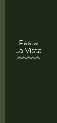
Menu List

Select a dish

Select a dish
Order saved
Add extra ingredients or modify your dish.

Order saved
Personal Final Design
Personal Final Design
After completing the project as a team, I decided to put my design skills to the test by creating a version of the app in my own style. I redesigned the same user flows we had previously defined, applying my personal design preferences to showcase an alternative approach. This allowed me to explore my creativity while still staying true to the core functionality we had established as a team.
After completing the project as a team, I decided to put my design skills to the test by creating a version of the app in my own style. I redesigned the same user flows we had previously defined, applying my personal design preferences to showcase an alternative approach. This allowed me to explore my creativity while still staying true to the core functionality we had established as a team.
Loading

Menu List

Select a dish

Add extra ingredients or modify your dish.

4.1 Change the dish previous

4.1 Change the dish next

Order saved

Loading
Menu List
Select a dish
Add extra ingredients or modify your dish.
4.1 Change the dish previous
4.1 Change the dish next
Order saved
My final reflection 📝
Important
This project was an invaluable opportunity to not only learn Figma and improve my technical skills but also to face the challenge of combining different graphic design styles within the team. Each of us had our own preferences: some leaned towards a more minimalistic and functional approach, while others preferred a more vibrant and visually rich style.
While mixing these tastes was a challenge, we managed to create a design that represented the team's collaboration. However, I decided to apply my own style and design it according to my preferences, which allowed me to not only put my graphic design skills to the test but also explore my creativity to the fullest. I’m presenting both versions: the team's collaborative design and my individual design, of which I’m very proud.
Thank You
For Watching
🫶
Thank You
For Watching
🫶
View More Case Studies 📝
View More Case Studies 📝
Insert Your Design Here
Macbook Pro
New chat
AI Chat Tool Ethics
Al Chat Tool Impact Writing
New chat
Clear conversations
Light mode
My account
Updates & FAQ
Other plans
Log out
Free vs. Plus: What Can You REALLY Do?
ChatGPT helps with everything from answering questions to generating content,
but not all versions are the same.
Upgrade to Plus for faster, smarter, and more powerful AI capabilities.
Free (GPT-3.5) – The Basics:
👉 Works well for simple tasks, but has limitations.
Plus (GPT-4 & More) – AI Without Limits
🛵 If Free is a bicycle, Plus is a high-speed electric scooter. 🚀
Which ChatGPT Plan Is Right for You?
See the key differences at a glance.
Feature
Accuracy & Depth
Speed
File Analysis
Table Creation
Image generation
Image Editing
Explore other GPTs
Personalization
Free
❌ Sometimes repeats answers or gets confused.
❌ Slows down during peak times.
❌ Cannot analyze documents.
❌ Not available.
❌ Not available.
❌ Not available.
❌ Not available.
❌ Not available.
Plus
✅ More logical, detailed, and creative responses.
✅ Always fast, no waiting.
✅ Upload PDFs, Excel, TXT & get instant summaries.
✅ Turns data into ready-to-use tables.
✅ Creates images from text. (Example: Design a minimalist logo)
✅ Modify AI-generated images!
✅ Access specialized GPTs: a coding expert, a logo designer, a travel planner.
✅ Create your own ChatGPT with personalized instructions.
Is Plus Worth It?
👉 If you only ask basic questions, Free is fine.
👉 If you want speed, accuracy, file analysis, image creation, and access to specialized GPTs, Plus is a productivity powerhouse.
🔥 Plus turns ChatGPT into your all-in-one assistant.
From writing reports to designing logos or analyzing contracts in PDFs.
📌 Now that you know… still sticking with Free?

Type message
A ChatGPT UX Case Study
Jan-Mar 25
UX Case Study
Fixing a Women's Rights Association Website
Nov-Dec 23
UX Case Study

Insert Your Design Here
Macbook Pro
New chat
AI Chat Tool Ethics
Al Chat Tool Impact Writing
New chat
Clear conversations
Light mode
My account
Updates & FAQ
Other plans
Log out
Free vs. Plus: What Can You REALLY Do?
ChatGPT helps with everything from answering questions to generating content,
but not all versions are the same.
Upgrade to Plus for faster, smarter, and more powerful AI capabilities.
Free (GPT-3.5) – The Basics:
👉 Works well for simple tasks, but has limitations.
Plus (GPT-4 & More) – AI Without Limits
🛵 If Free is a bicycle, Plus is a high-speed electric scooter. 🚀
Which ChatGPT Plan Is Right for You?
See the key differences at a glance.
Feature
Accuracy & Depth
Speed
File Analysis
Table Creation
Image generation
Image Editing
Explore other GPTs
Personalization
Free
❌ Sometimes repeats answers or gets confused.
❌ Slows down during peak times.
❌ Cannot analyze documents.
❌ Not available.
❌ Not available.
❌ Not available.
❌ Not available.
❌ Not available.
Plus
✅ More logical, detailed, and creative responses.
✅ Always fast, no waiting.
✅ Upload PDFs, Excel, TXT & get instant summaries.
✅ Turns data into ready-to-use tables.
✅ Creates images from text. (Example: Design a minimalist logo)
✅ Modify AI-generated images!
✅ Access specialized GPTs: a coding expert, a logo designer, a travel planner.
✅ Create your own ChatGPT with personalized instructions.
Is Plus Worth It?
👉 If you only ask basic questions, Free is fine.
👉 If you want speed, accuracy, file analysis, image creation, and access to specialized GPTs, Plus is a productivity powerhouse.
🔥 Plus turns ChatGPT into your all-in-one assistant.
From writing reports to designing logos or analyzing contracts in PDFs.
📌 Now that you know… still sticking with Free?
Type message
A ChatGPT UX Case Study
Jan-Mar 25
UX Case Study
Fixing a Women's Rights Association Website
Nov-Dec 23
UX Case Study
Neo
design
Neo
design