What I Learned Designing UX
for a Privacy Tech Product
What I Learned Designing UX
for a Privacy Tech Product
What I Learned
Designing UX
for a
Privacy Tech Product

Real client
UX Case Study

The project 🤓
The project 🤓
I spent six months at SecurePrivacy.ai as a UX design intern (Jan–Jun 2025). Together with Anu and Houary, I collaborated on research, design, and testing efforts to improve the company’s main website experience. While the three of us worked on the same overall case, we each took on different tasks and responsibilities, so our individual case studies may reflect slightly different scopes.
In parallel, I was individually assigned to design the UX for a new product in their portfolio — Secure Privacy Governance — laying the UX foundation for its future development.
This case study brings together the full scope of my internship contributions.
Tools:
Tools:
Figma, V0, Miro, Scribbl, Otter.ai, Gsuite
Figma, V0, Miro, Scribbl, Otter.ai, Gsuite
Figma, Figjam, Scribbl, Otter.ai,
Gsuite
Duration:
Duration:
January - June 2025
January - June 2025
January - June 2025

Houary
Houary
Houary
Dan (The boss)
Dan (The boss)
Dan (The boss)
Anu
Anu
Anu
Me
Me
Me


Dan (The boss)
Dan (The boss)
Dan (The boss)
Anu
Anu
Anu
Me
Me
Me

Problem Statement 🚨
Problem Statement 🚨
Problem Statement 🚨
SecurePrivacy.ai wanted to increase client sign-ups, but there wasn’t a clear diagnosis of what was going wrong. Our challenge was to explore the user experience and determine what might stop potential customers from taking action.
Initial Project Goals 🎯
Initial Project Goals 🎯
1
Evaluate how effectively the website communicates SecurePrivacy.ai’s value
Understand if users grasp what the product does, for whom, and why it matters.
2
Identify usability and conversion barriers across key pages
Uncover friction points in navigation, content, and pricing that may impact user engagement.
3
Support the early UX definition of a new product: Secure Privacy Governance
Begin exploring user needs, flows, and opportunities to shape the foundation of this new offering.
1
1
Evaluate how effectively the website communicates SecurePrivacy.ai’s value
Evaluate how effectively the website communicates SecurePrivacy.ai’s value
2
2
Identify usability and conversion barriers across key pages
Identify usability and conversion barriers across key pages
3
3
Support the early UX definition of a new product: Secure Privacy Governance
Support the early UX definition of a new product: Secure Privacy Governance
The Process ✅
The Process ✅
Discover
Discover
Discover
Define
Define
Define
Ideate
Ideate
Ideate
Design
Design
Design
Research Summary 📄
Research Summary 📄
To uncover opportunities for improving Secure Privacy’s website experience, we conducted a two-part research phase: desk research and qualitative user interviews.
To uncover opportunities for improving Secure Privacy’s website experience, we conducted a two-part research phase: desk research and qualitative user interviews.
To improve the experience for both free and premium users, it was essential to understand their motivations, frustrations, and expectations. This phase involved a combination of desk research, user interviews, and usability testing to gather qualitative and quantitative insights.
Desk Research 💻
Desk Research 💻
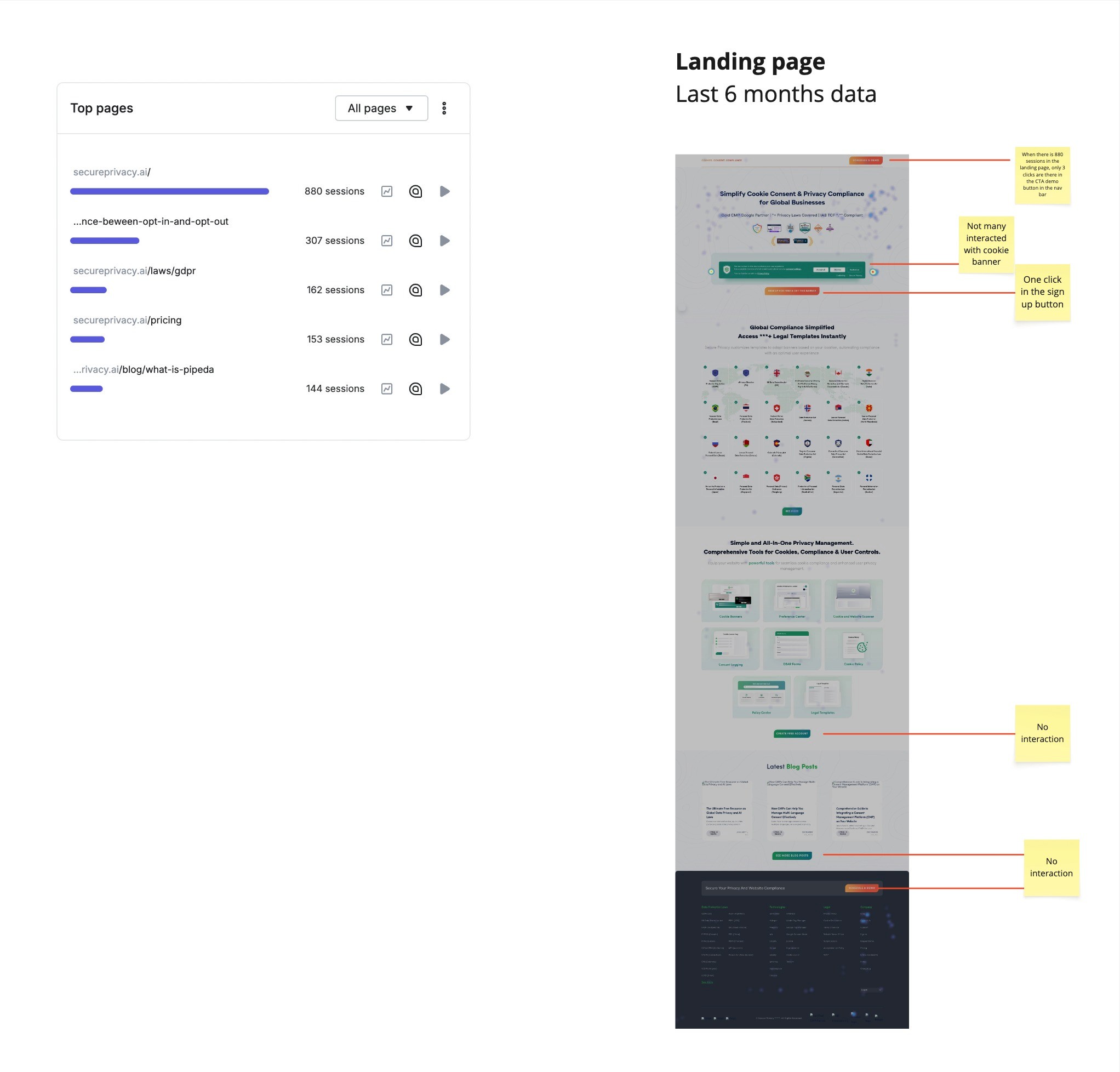
We began with an in-depth analysis of the website and user behavior using tools like Google Analytics, Hotjar, and competitor benchmarking. This helped us identify patterns and friction points across key pages.
Key findings included:
The site felt text-heavy and lacked clear visual hierarchy.
Key elements such as pricing, CTAs, and value proposition were difficult to locate or understand.
The experience didn’t adapt to different user types (e.g., marketers vs. developers).
Overly technical language risked alienating non-expert users.
Before talking to users, I started with a desk research phase to understand how people feel about ChatGPT’s free and Plus experiences.
What I looked into:
Forums like Reddit and OpenAI’s Community, where users share honest thoughts about limitations, upgrades, and expectations.
A quick competitor analysis (Claude, Gemini, DeepSeek, Copilot, etc.) to compare pricing, features, and overall value.
A feature breakdown of ChatGPT vs. competitors to understand where it stands out—or falls short.
Key takeaways:
Many users don’t clearly understand Plus benefits.
Some say the free version works “well enough”, so they don’t see the need to upgrade.
Frustration with limits is common, but uncertainty about value and cancellation holds people back.
Competitors offer more visible “premium perks”, influencing how ChatGPT Plus is perceived.


Forming Hypotheses 💭
Forming Hypotheses 💭
If we improve the platform’s clarity and simplicity, streamline navigation and UI, reduce technical jargon and heavy text, and provide more transparent, concise messaging about what the product does and why it matters, then users will better understand its value—leading to increased trust, improved user engagement, and higher conversion rates.
If we improve the platform’s clarity and simplicity, streamline navigation and UI, reduce technical jargon and heavy text, and provide more transparent, concise messaging about what the product does and why it matters, then users will better understand its value—leading to increased trust, improved user engagement, and higher conversion rates.
User Interviews & User Testing 🎤
User Interviews & User Testing 🎤
We conducted 14 in-depth interviews across six user profiles, using tailored interview scripts for each:
We conducted 14 in-depth interviews across six user profiles, using tailored interview scripts for each:
🧭
Profile A:
Non-users
6 participants
🧭
Profile A:
Non-users
6 participants
🧭
Profile A:
Non-users
6 participants
🧑💻
Profile B:
In-house developer
1 participant
🧑💻
Profile B:
In-house developer
1 participant
🧑💻
Profile B:
In-house developer
1 participant
🌐
Profile C:
External developers
3 participants
🌐
Profile C:
External developers
3 participants
🌐
Profile C:
External developers
3 participants
⚖️
Profile D:
Legal professional
1 participant
⚖️
Profile D:
Legal professional
1 participant
⚖️
Profile D:
Legal professional
1 participant
🎯
Profile E:
Product prospect
1 participant
🎯
Profile E:
Product prospect
1 participant
🎯
Profile E:
Product prospect
1 participant
🔐
Profile F:
SP Project Manager
1 participant
🔐
Profile F:
SP Project Manager
1 participant
🔐
Profile F:
SP Project Manager
1 participant
We also facilitated a collaborative workshop with the Secure Privacy team (Profile G), which helped us contrast internal expectations with external feedback and align around key priorities.
We also facilitated a collaborative workshop with the Secure Privacy team (Profile G), which helped us contrast internal expectations with external feedback and align around key priorities.
Learning
One limitation we encountered was the uneven number of participants across groups. This was due to recruitment constraints and the niche nature of some user profiles (e.g., legal, in-house developers, or prospects in an active buying process). While not every group was represented equally, we ensured that each perspective was covered and that insights were triangulated with desk research and internal stakeholder input to maintain depth and reliability in our findings.


One limitation we encountered was the uneven number of participants across groups. This was due to recruitment constraints and the niche nature of some user profiles (e.g., legal, in-house developers, or prospects in an active buying process). While not every group was represented equally, we ensured that each perspective was covered and that insights were triangulated with desk research and internal stakeholder input to maintain depth and reliability in our findings.
Learning
Synthesis Process 🗺️
Turning Raw Data into Actionable Insights
Synthesis Process 🗺️
Turning Raw Data into Actionable Insights
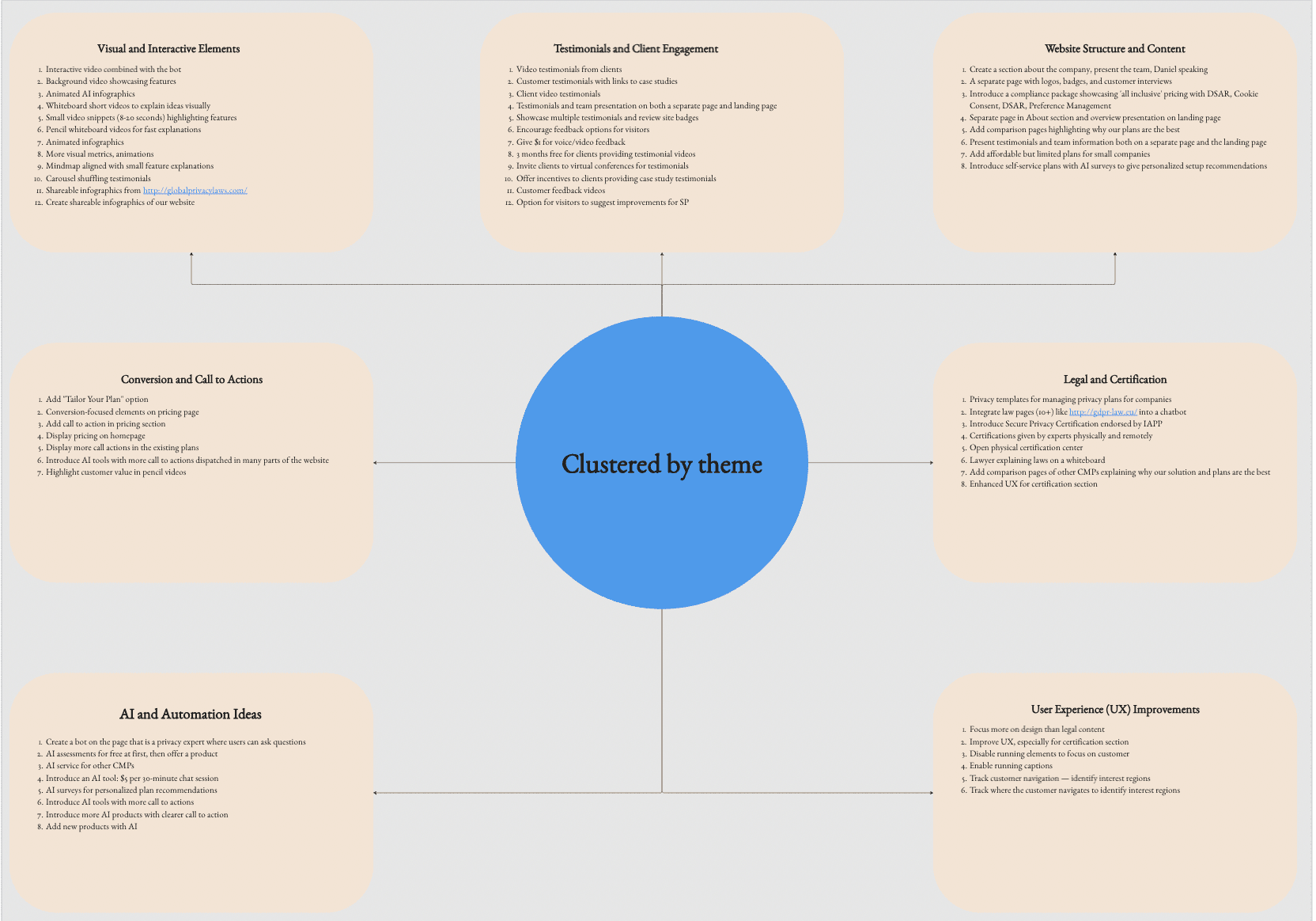
At first, we grouped the insights by user type to understand their specific problems. Later, we saw patterns across groups and organized everything by theme — like clarity, trust, pricing, and navigation.
Each insight card below shows what we learned, includes real user quotes, and asks a “How Might We” question to guide design ideas.
The following visuals show our synthesis process— first by downloading the interviews, then by user group, then we clusterized by insight category — illustrating how our thinking evolved over time.


Insights & Opportunity Areas 🗝️
Insights & Opportunity Areas 🗝️
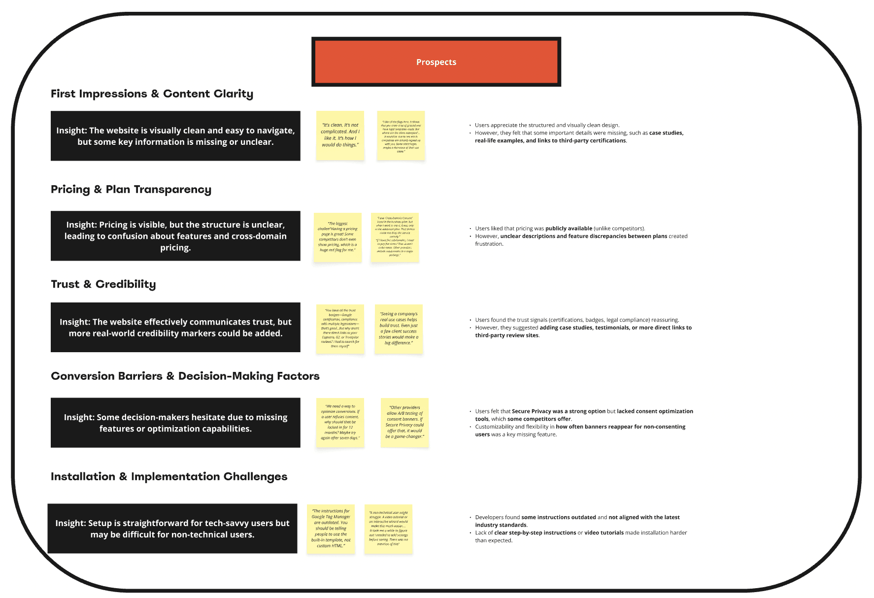
Insight 1
Clarity & Simplicity
Many users struggled to understand what SecurePrivacy.ai offers due to complex language, dense content, and poor visual hierarchy.
“There’s so much text everywhere… I don’t know where to start.” (Non-user)
“There’s a lot of legal wording… I had to re-read a few times.” (Developer)
“Is this for legal teams? For developers? I’m not sure if this is even for me.” (Non-user)
Opportunity area:
How might we simplify the site’s language, structure, and content to make the product’s value instantly clear to all users?Relevant for: 👤 Non-users 👨💻 Developers 🧑💼 Prospects
Insight 2
Trust & Credibility
Users felt the website lacked strong trust-building elements such as recognizable logos, case studies, company information and third-party credibility signals.
“I want to know that this is a real company—show me some clients, logos, security badges, anything!” (Non-user)
“Seeing a company’s real use cases helps me trust them. Just a few client success stories would make a difference.” (Prospect)
“Most privacy teams are not tech-savvy, so the platform must be easy to use, transparent, and simple.” (Legal)
Opportunity area:
How might we build user trust through visual signals, real-world examples, and transparent compliance messaging?Relevant for: 👤 Non-users 🧑💼 Prospects ⚖️ Legal
Insight 3
Pricing Transparency
Although pricing is visible, the structure is confusing and makes it hard to compare plans or understand value differences.
“I saw a pricing page but it was confusing. Which one do I need?” (Non-user)
“Unclear descriptions and feature discrepancies between plans created frustration.” (Prospect)
“I don’t really know what
I’d be paying for.” (Non-user)
Opportunity area:
How might we clarify pricing structures and surface the value of each tier to reduce friction and support confident decision-making?Relevant for: 👤 Non-users 🧑💼 Prospects
Insight 4
Navigation & Action Flow
Users found the navigation confusing and were unsure how to complete core actions like testing, setup, or evaluation.
“I couldn’t figure out where to go to actually test or set something up. It took too many clicks.” (Developer)
“Users feel overwhelmed by long menus and text, prefer visuals, and need human interaction before purchasing.” (Non-user)
“The instructions for Google Tag Manager are outdated. You should be using the built-in settings, not custom HTML.” (Developer)
Opportunity area:
How might we create a more intuitive, goal-oriented navigation and onboarding flow for both technical and non-technical users?Relevant for: 👤 Non-users 👨💻 Developers
Insight 5
First Impressions & Value Proposition
Despite having a lot of content, the homepage and product pages don’t immediately communicate what the product does or why it matters.
“It’s clean, it’s not complicated. And I like it. It’s how I would do things… but I still don’t get what it does.” (Prospect)
“It looks trustworthy, but I don’t know if I need this or not.” (Non-user)
“We need an easy way to explain this to clients, or other departments.”
(Decision-maker)
Opportunity area:
How might we clearly communicate the product’s value within the first few seconds of landing on the website?Relevant for: 🧑💼 Prospects 👤 Non-users 🧑⚖️ Decision-makers
Insight 6
Continuous Compliance
Legal experts view compliance as an ongoing, evolving effort — not a one-time task — and want tools that support this mindset.
“There is no such thing as ‘done’ with compliance. It has to be part of the everyday operations.” (Legal)
“The biggest challenge is to embed solutions in processes realistically—you may not get paperwork done, but daily integration helps.” (Legal)
“European privacy regulations are evolving rapidly. It’s becoming more complex, and tools need to keep up.”
(Legal)(Decision-maker)
Opportunity area:
How might we help companies view compliance as an ongoing process by providing tools for regular assessment and adaptation?Relevant for: ⚖️ Legal teams, 🧑💼 Prospects
Ideation Process 💡
Co-creating with SecurePrivacy Team
Ideation Process 💡
Co-creating with SecurePrivacy Team
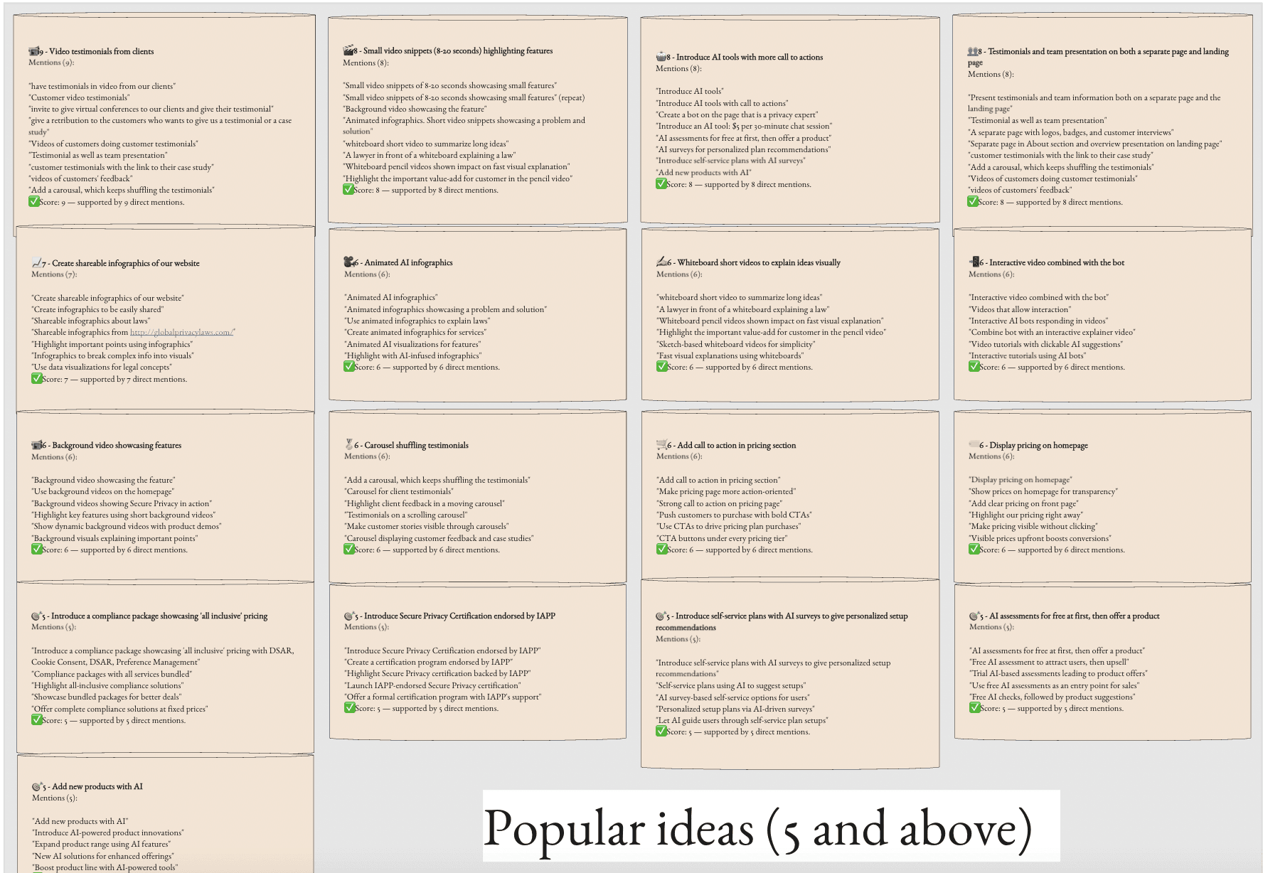
To turn our research into solutions, we hosted a collaborative ideation workshop with the SecurePrivacy team — focusing on user needs and business goals.
We ran two key activities:
✍️ Brainwriting 6-3-5
→ Generated dozens of concepts around clarity, pricing, onboarding, and AI.🗺️ Sticky Notes on Screens
Team members left feedback on actual site screenshots.
→ Surfaced real pain points tied directly to the UI.
We then clustered all ideas by theme, scored them by impact and effort, and created a clear shortlist of high-value opportunities to explore in design.
Most Promising Ideas Selected
These ideas stood out for high impact and feasibility, and were integrated into the redesign:
Clarify the product’s value fast: Add visual cues and simple messaging to the homepage.
Add testimonials and About Us section: Build trust and humanize the brand.
Improve pricing section: Use subpages, clearer tiers, and strong CTAs.
Replace stock imagery with custom content: Recommend creating original videos (e.g., team, client stories).
Highlight product features with AI animations or infographics.
Create a new product section in the menu: Make Governance and other products easy to find.
Note: While several top ideas involve video content, this case study excludes video production / infographics. Instead, we recommend that SecurePrivacy invest in custom, human-centered content (e.g., real team, client stories) to better connect with users and differentiate from generic competitors.

Defining priorities with Dan
Defining priorities with Dan


Design 🖊️
Design 🖊️
After synthesizing our research and workshop results, we translated the most urgent user needs into five core UX priorities. Each one guided design decisions and is directly linked to what we discovered in the field.
1. Make the product’s value instantly clear
Many users — especially non-experts — struggled to understand what SecurePrivacy.ai does and why they need it.
✅ What we did: We redesigned the landing page with a more visual approach — adding imagery, simplifying the language, and making the product’s purpose clear and immediate.

Illustrative section explaining
the system
Entry-level tools
Certifications and trust badges upfront
Simplified headline & strong
value proposition
Simplified headline & strong value proposition
Testimonials for trust
Photography for trust
and relatability
Social proof and credibility boosters
Secure Privacy Governance Banner
New product visibility.
Real user quotes to
reinforce benefits
Real user quotes to
reinforce benefits

2. Simplify navigation and key user flows
Users found the site’s structure overwhelming and difficult to navigate, particularly in menus and technical documentation.
✅ What we did: We conducted a deep audit of navigation patterns across competitors and combined that with research findings to redesign the main navigation bar, menus, and submenus — making them more intuitive and user-oriented.
Also I designed all the new / different pages missing.

From this:
To this:
From this:
To this:
Some of the key changes included:
New “Solutions by Role” section
Regulations grouped by continent plus a “+55 regulations” quick search.
Platform integrations moved to “Solutions
New “Products” tab: To clearly showcase our core offering and introduce our new product: Privacy Governance.
Pricing split into three views: Plans & Pricing, Enterprise Plans, and Billing FAQs — making it easier for users at different buying stages.
Partner menu expanded
“Company” tab created: Includes About Us, Careers, Press, and Contact — a response to user feedback requesting more transparency.
3. Build trust through visual and content cues
The site lacked visual signals that communicate credibility and human presence, which affected user confidence.
✅ What we did: We added real customer logos and testimonials in different pages, and created new ones like About Us, Careers, and News & Press — making SecurePrivacy feel like a real, established company, not just a tool.


4. Communicate ongoing compliance as a process
Legal and compliance professionals need to manage privacy as a continuous, evolving responsibility — not a one-time setup.
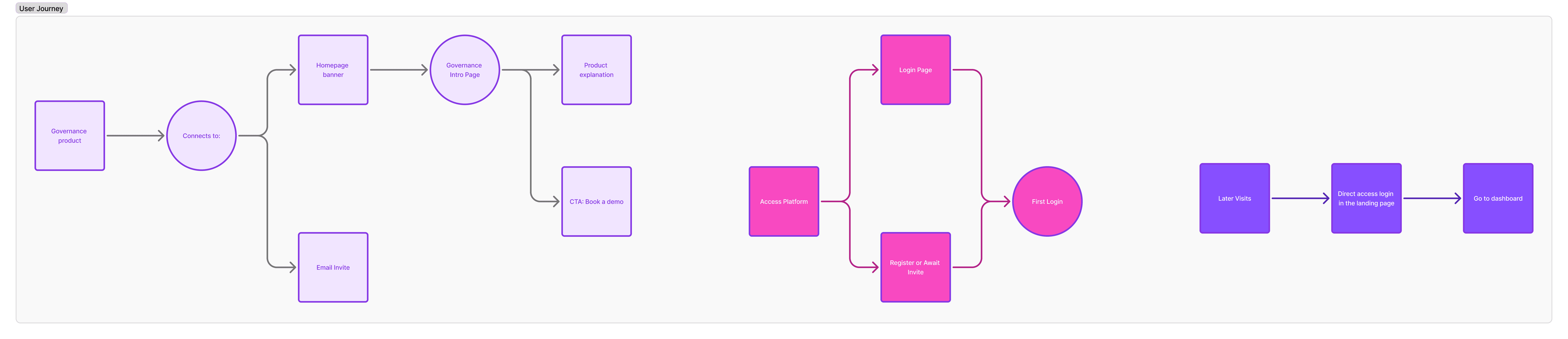
✅ What I did: I was assigned to design a new product from the ground up: Secure Privacy Governance. This solution focuses on supporting companies in managing compliance as an ongoing process. The initiative is still under development and was created specifically to address this insight.
Drawing from my experience working with brands, I recommended launching this product using a distinct color from the Secure Privacy palette. This would help visually differentiate it from the CMP product and reinforce its unique value. Additionally, I developed initial screen flows to explore the onboarding experience and early interactions for both new and existing users of other Secure Privacy products.
4. Communicate ongoing compliance as a process
Legal and compliance professionals need to manage privacy as a continuous, evolving responsibility — not a one-time setup.
✅ What I did: I was assigned to design a new product from the ground up: Secure Privacy Governance. This solution focuses on supporting companies in managing compliance as an ongoing process. The initiative is still under development and was created specifically to address this insight.
Drawing from my experience working with brands, I recommended launching this product using a distinct color from the Secure Privacy palette. This would help visually differentiate it from the CMP product and reinforce its unique value. Additionally, I developed initial screen flows to explore the onboarding experience and early interactions for both new and existing users of other Secure Privacy products.

Placement of a section on the landing page to direct traffic to get more information.

Specific page for the launch of the new product.
Explaining the features
on a simple way
The target
Explaining very clearly
how it works
Call to Action
CTA Book a Demo
New product
main banner

Currently the log in was just for the CMP product, but we need different options for when the new product will be launched
Option 1: Unified Log In Portal
Option 2: Log In for both products in landing page


Log In page

Registration page
Conclusion 🔚
Conclusion 🔚
To strengthen the platform’s credibility, clarity, and user engagement, we propose a multifaceted approach:
Refine the site’s storytelling by redesigning and developing all new subpages to create a more cohesive and compelling narrative.
Invest in original content production — including custom images and videos — to enhance authenticity and build trust with users.
Collaborate with current clients to create case studies that demonstrate real-world impact and reinforce social proof.
Continue A/B testing to validate hypotheses and iteratively optimize messaging and design based on user behavior and feedback.
These strategic actions aim to create a more engaging, trustworthy, and conversion-driven platform experience.
My Internship Learnings 📝
My final reflection:
My First Solo UX Project📝
My final reflection:
My First Solo UX Project📝
Important
Important
During this internship, I really enjoyed being part of a project from the ground up, with constant support from the CEO. Although I’ve worked with many brands in advertising, this was my first time approaching a project from a UX perspective and collaborating closely with developers, which was a great learning experience.
We also explored how AI can streamline processes, which added a valuable layer to our work. One of the highlights was leading a workshop for the entire company—we received great feedback.
Overall, I’m really happy with what we achieved and I’m leaving the project with new skills and insights.
Thank You
For Watching
🫶
Thank You
For Watching
🫶
Thank You
For Watching
🫶
View More Case Studies 📝
View More Case Studies 📝
View More Case Studies 📝
Insert Your Design Here
Macbook Pro
New chat
AI Chat Tool Ethics
Al Chat Tool Impact Writing
New chat
Clear conversations
Light mode
My account
Updates & FAQ
Other plans
Log out
Free vs. Plus: What Can You REALLY Do?
ChatGPT helps with everything from answering questions to generating content,
but not all versions are the same.
Upgrade to Plus for faster, smarter, and more powerful AI capabilities.
Free (GPT-3.5) – The Basics:
👉 Works well for simple tasks, but has limitations.
Plus (GPT-4 & More) – AI Without Limits
🛵 If Free is a bicycle, Plus is a high-speed electric scooter. 🚀
Which ChatGPT Plan Is Right for You?
See the key differences at a glance.
Feature
Accuracy & Depth
Speed
File Analysis
Table Creation
Image generation
Image Editing
Explore other GPTs
Personalization
Free
❌ Sometimes repeats answers or gets confused.
❌ Slows down during peak times.
❌ Cannot analyze documents.
❌ Not available.
❌ Not available.
❌ Not available.
❌ Not available.
❌ Not available.
Plus
✅ More logical, detailed, and creative responses.
✅ Always fast, no waiting.
✅ Upload PDFs, Excel, TXT & get instant summaries.
✅ Turns data into ready-to-use tables.
✅ Creates images from text. (Example: Design a minimalist logo)
✅ Modify AI-generated images!
✅ Access specialized GPTs: a coding expert, a logo designer, a travel planner.
✅ Create your own ChatGPT with personalized instructions.
Is Plus Worth It?
👉 If you only ask basic questions, Free is fine.
👉 If you want speed, accuracy, file analysis, image creation, and access to specialized GPTs, Plus is a productivity powerhouse.
🔥 Plus turns ChatGPT into your all-in-one assistant.
From writing reports to designing logos or analyzing contracts in PDFs.
📌 Now that you know… still sticking with Free?

Type message
Type message
A ChatGPT UX Case Study
Jan-Mar 25
UX Case Study
Fixing a Women's Rights Association Website
Nov-Dec 23
UX Case Study


Insert Your Design Here
Macbook Pro
New chat
AI Chat Tool Ethics
Al Chat Tool Impact Writing
New chat
Clear conversations
Light mode
My account
Updates & FAQ
Other plans
Log out
Free vs. Plus: What Can You REALLY Do?
ChatGPT helps with everything from answering questions to generating content,
but not all versions are the same.
Upgrade to Plus for faster, smarter, and more powerful AI capabilities.
Free (GPT-3.5) – The Basics:
👉 Works well for simple tasks, but has limitations.
Plus (GPT-4 & More) – AI Without Limits
🛵 If Free is a bicycle, Plus is a high-speed electric scooter. 🚀
Which ChatGPT Plan Is Right for You?
See the key differences at a glance.
Feature
Accuracy & Depth
Speed
File Analysis
Table Creation
Image generation
Image Editing
Explore other GPTs
Personalization
Free
❌ Sometimes repeats answers or gets confused.
❌ Slows down during peak times.
❌ Cannot analyze documents.
❌ Not available.
❌ Not available.
❌ Not available.
❌ Not available.
❌ Not available.
Plus
✅ More logical, detailed, and creative responses.
✅ Always fast, no waiting.
✅ Upload PDFs, Excel, TXT & get instant summaries.
✅ Turns data into ready-to-use tables.
✅ Creates images from text. (Example: Design a minimalist logo)
✅ Modify AI-generated images!
✅ Access specialized GPTs: a coding expert, a logo designer, a travel planner.
✅ Create your own ChatGPT with personalized instructions.
Is Plus Worth It?
👉 If you only ask basic questions, Free is fine.
👉 If you want speed, accuracy, file analysis, image creation, and access to specialized GPTs, Plus is a productivity powerhouse.
🔥 Plus turns ChatGPT into your all-in-one assistant.
From writing reports to designing logos or analyzing contracts in PDFs.
📌 Now that you know… still sticking with Free?
Type message
Type message
A ChatGPT UX Case Study
Jan-Mar 25
UX Case Study
Fixing a Women's Rights Association Website
Nov-Dec 23
UX Case Study
Insert Your Design Here
Macbook Pro
New chat
AI Chat Tool Ethics
Al Chat Tool Impact Writing
New chat
Clear conversations
Light mode
My account
Updates & FAQ
Other plans
Log out
Free vs. Plus: What Can You REALLY Do?
ChatGPT helps with everything from answering questions to generating content,
but not all versions are the same.
Upgrade to Plus for faster, smarter, and more powerful AI capabilities.
Free (GPT-3.5) – The Basics:
👉 Works well for simple tasks, but has limitations.
Plus (GPT-4 & More) – AI Without Limits
🛵 If Free is a bicycle, Plus is a high-speed electric scooter. 🚀
Which ChatGPT Plan Is Right for You?
See the key differences at a glance.
Feature
Accuracy & Depth
Speed
File Analysis
Table Creation
Image generation
Image Editing
Explore other GPTs
Personalization
Free
❌ Sometimes repeats answers or gets confused.
❌ Slows down during peak times.
❌ Cannot analyze documents.
❌ Not available.
❌ Not available.
❌ Not available.
❌ Not available.
❌ Not available.
Plus
✅ More logical, detailed, and creative responses.
✅ Always fast, no waiting.
✅ Upload PDFs, Excel, TXT & get instant summaries.
✅ Turns data into ready-to-use tables.
✅ Creates images from text. (Example: Design a minimalist logo)
✅ Modify AI-generated images!
✅ Access specialized GPTs: a coding expert, a logo designer, a travel planner.
✅ Create your own ChatGPT with personalized instructions.
Is Plus Worth It?
👉 If you only ask basic questions, Free is fine.
👉 If you want speed, accuracy, file analysis, image creation, and access to specialized GPTs, Plus is a productivity powerhouse.
🔥 Plus turns ChatGPT into your all-in-one assistant.
From writing reports to designing logos or analyzing contracts in PDFs.
📌 Now that you know… still sticking with Free?
Type message
A ChatGPT UX Case Study
Jan-Mar 25
UX Case Study
Fixing a Women's Rights Association Website
Nov-Dec 23
UX Case Study